


The only thing I want from Apple's big 2025 redesign is a
There are a lot of rumors flying around about a big iOS and macOS redesign coming this year, perhaps as a distraction to the continued issues around Apple Intelligence. And while I’m game for a fresh coat of paint across the software I use every single day, I have one plea while Apple’s at it: Please, for the love of god, make the Notes app render the letter “a” properly. Let me back up a bit. Apple first introduced the San Francisco typeface with the first Apple Watch in 2015; a few years later it became the default on basically every device Apple sells. The text you see in Messages, Apple Music, Maps and many other system apps are all different San Francisco fonts, and for the most part the multiple variations all feel consistent and cohesive. But, at some point in the last seven or eight years I noticed something odd in the Apple Notes app. The font appears the same as the other San Francisco fonts, but something just felt “off.” It took forever before I put my finger on it: the lowercase “a” renders differently in the Notes app than it does anywhere else across the entire system. You see, the Notes app uses a “single storey a,” the sort of “a” that most people use when writing by hand. That’s the only first-party app, as far as I can tell, where you’ll find a single-storey a. The rest of the time, it uses the double-storey a (just as you’ll see on this website and almost everywhere else a lowercase a is used these days outside of handwriting). To be clear, this does not matter even a little bit. In fact, the completely inconsequential and random nature of this situation is probably why it irks me so. Part of me is glad I figured out exactly what was throwing me off, because for years Notes just looked wrong in a way that I found impossible to describe. Now at least I know what my brain was reacting to. One day recently we were having a lively discussion about fonts in the Engadget Slack, which triggered me to bring up this mystery. My colleagues both agreed that this was bizarre and also thought I was a bit of a lunatic for spending this much time thinking about a single character in a single app. This, of course, drove me to download and dig through all of Apple’s system fonts and their variations to find the dreaded “Latin small letter Alpha,” or α, that our resident Greek Cypriot Aaron Souppouris suggested I search for. Indeed, that’s what pops up in Notes instead of the usual “a.” It’s not even one of the font variants, as far as I can tell. [Ed. note: Nathan did no other work during this time.] Even though this is a ridiculous thing to think about, I want to know what’s going on here! How did this happen? Who made this decision, and for what reason? Maybe it’s because the Notes app originally used a skeuomorphic “Marker Felt” sort of text that emulated handwriting — using the single storey “a” is perhaps a nod to how most people actually handwrite the letter. Or, perhaps, it’s just something that slipped through the cracks years ago and hasn’t been worth changing because most people probably haven’t consciously noticed the difference (you’re welcome). Whatever the reason, I sure would love it if Apple unified things with the iOS 19 (and corresponding macOS) redesign. I generally find the default Apple font to be just fine, though people certainly have their own very strongly held opinions about typography. But if I’m being honest, I’d also probably miss that oddball α — it’s always fun to have an unsolved mystery to ponder over, no matter how inconsequential.This article originally appeared on Engadget at https://www.engadget.com/apps/the-only-thing-i-want-from-apples-big-2025-redesign-is-a-120023531.html?src=rss

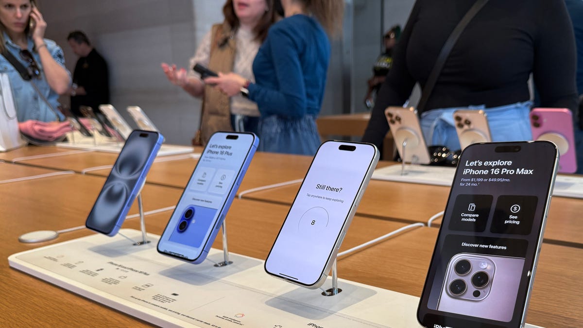
There are a lot of rumors flying around about a big iOS and macOS redesign coming this year, perhaps as a distraction to the continued issues around Apple Intelligence. And while I’m game for a fresh coat of paint across the software I use every single day, I have one plea while Apple’s at it: Please, for the love of god, make the Notes app render the letter “a” properly.
Let me back up a bit. Apple first introduced the San Francisco typeface with the first Apple Watch in 2015; a few years later it became the default on basically every device Apple sells. The text you see in Messages, Apple Music, Maps and many other system apps are all different San Francisco fonts, and for the most part the multiple variations all feel consistent and cohesive.
But, at some point in the last seven or eight years I noticed something odd in the Apple Notes app. The font appears the same as the other San Francisco fonts, but something just felt “off.” It took forever before I put my finger on it: the lowercase “a” renders differently in the Notes app than it does anywhere else across the entire system.
You see, the Notes app uses a “single storey a,” the sort of “a” that most people use when writing by hand. That’s the only first-party app, as far as I can tell, where you’ll find a single-storey a. The rest of the time, it uses the double-storey a (just as you’ll see on this website and almost everywhere else a lowercase a is used these days outside of handwriting).
To be clear, this does not matter even a little bit. In fact, the completely inconsequential and random nature of this situation is probably why it irks me so. Part of me is glad I figured out exactly what was throwing me off, because for years Notes just looked wrong in a way that I found impossible to describe. Now at least I know what my brain was reacting to.
One day recently we were having a lively discussion about fonts in the Engadget Slack, which triggered me to bring up this mystery. My colleagues both agreed that this was bizarre and also thought I was a bit of a lunatic for spending this much time thinking about a single character in a single app. This, of course, drove me to download and dig through all of Apple’s system fonts and their variations to find the dreaded “Latin small letter Alpha,” or α, that our resident Greek Cypriot Aaron Souppouris suggested I search for. Indeed, that’s what pops up in Notes instead of the usual “a.” It’s not even one of the font variants, as far as I can tell. [Ed. note: Nathan did no other work during this time.]
Even though this is a ridiculous thing to think about, I want to know what’s going on here! How did this happen? Who made this decision, and for what reason? Maybe it’s because the Notes app originally used a skeuomorphic “Marker Felt” sort of text that emulated handwriting — using the single storey “a” is perhaps a nod to how most people actually handwrite the letter. Or, perhaps, it’s just something that slipped through the cracks years ago and hasn’t been worth changing because most people probably haven’t consciously noticed the difference (you’re welcome).
Whatever the reason, I sure would love it if Apple unified things with the iOS 19 (and corresponding macOS) redesign. I generally find the default Apple font to be just fine, though people certainly have their own very strongly held opinions about typography. But if I’m being honest, I’d also probably miss that oddball α — it’s always fun to have an unsolved mystery to ponder over, no matter how inconsequential.This article originally appeared on Engadget at https://www.engadget.com/apps/the-only-thing-i-want-from-apples-big-2025-redesign-is-a-120023531.html?src=rss


