


The Bible, redesigned for the Instagram age
Bible designs tend to be variations on a theme—tissue-thin paper and unforgiving font sizes, owing to the 783,000 words crammed into a single normal-sized book (the average novel, by comparison, clocks in at 70,000–100,000 words). Cheap faux-leather covers. A bookmark ribbon, maybe. If you’re a person of faith, it’s perhaps not the most fitting frame for what is defined as the literal word of God. If you’re a design zealot, it’s heretical object quality. If you’re both, well—prayers. The Bible is a book utterly ripe for a redesign. So Dylan Da Silva did just that with his Byble project, which released a bespoke hypermodern 11.5-pound edition of Genesis (the first book of the Hebrew Bible and the Christian Old Testament) last fall, and this week is launching its next volume, Matthew (the first book of the Christian New Testament). “Our mission, I guess, is simple—craftsmanship beyond words,” Da Silva says. “Crafting products so beautiful, they elevate the experience of reading the most powerful book ever written.” The Genesis Da Silva is not a designer, nor does he work in publishing. Rather, he comes from a property development background. Around 2022, the Sydney-based Da Silva was pondering how he could build a business around something of great meaning to him. He realized that while many people own a Bible, they generally don’t display it. And given that we live in a consumer society driven by aesthetics, he saw an opportunity to craft something new in that blank space. While he lacks visual design creds, he has experience with architectural design, and the Bible is very much a structural design challenge owing to its system of numbered verses and chapters. Da Silva wanted to keep the focus exclusively on the text (here, the King James Version—“the word is beautiful enough as it is”), so he decided not to feature any illustration or photography, and instead offer a solution that was purely typographic, which he developed with a partner in Greece over the course of two years. Another key goal was to design a system that would allow for a deeper reading of the Bible. To that end, he is breaking the Bible’s many books out of the larger whole and into single volumes, starting, naturally, with Genesis, which dominates the spine and cover of the first release in a debossed Grotesk. Da Silva drew inspiration from the Gutenberg Bible, with its distinct columns and margins and occasional typographic flair, and also sought to home in on particular moments for readers in pull quotes, translucent overlays, and bold all-caps spreads (the brand dubs these “yield” moments, thus the “Y” in “Byble”). It has the effect of slowing the books down and allowing text to breathe in an otherwise daunting 783,000-word experience. “We obsess over every detail, every page, every layout,” he says. “Ultimately, we are accessible to the reader.” OPENING A DOOR In addition to the new text presentation, Da Silva went wild on the production specs for the 13×10-inch volumes. Rather than fragile gossamer pages, he brought in a hefty 220 gsm stock. Hardcovers with silkscreened fabric. Typographic edge painting. Each book is available in two colorways—in the case of Genesis, black or green, the latter being a tip of the hat to the Garden of Eden. And for Matthew, white and red, the latter signifying the blood of Christ. All this production value comes at a cost: Currently the Byble costs $149, which has rankled some commenters on social media. “Our cost to produce is quite expensive,” Da Silva says. “The margin is not massive; it’s a standard margin for a business. … I think we’re reasonably priced. I knew there was always going to be a pushback.” Following Matthew, Da Silva is focusing on eight of the other most popular books of the Bible—Psalms, Proverbs, Exodus, Romans, Mark, Paul, John and Revelation. He wants to have five or six out by the end of the year, and then keep launching more from there, with special editions mixed in. His target audience? The devout, of course, but also design lovers and those who the Byble aesthetic could resonate with in new ways. “The goal for us is really reaching that younger generation who might be curious to learn more, who might think that the Bible is boring, or religion is boring,” Da Silva says. “We’re trying to open up a door for them.”
Bible designs tend to be variations on a theme—tissue-thin paper and unforgiving font sizes, owing to the 783,000 words crammed into a single normal-sized book (the average novel, by comparison, clocks in at 70,000–100,000 words). Cheap faux-leather covers. A bookmark ribbon, maybe.
If you’re a person of faith, it’s perhaps not the most fitting frame for what is defined as the literal word of God. If you’re a design zealot, it’s heretical object quality. If you’re both, well—prayers.
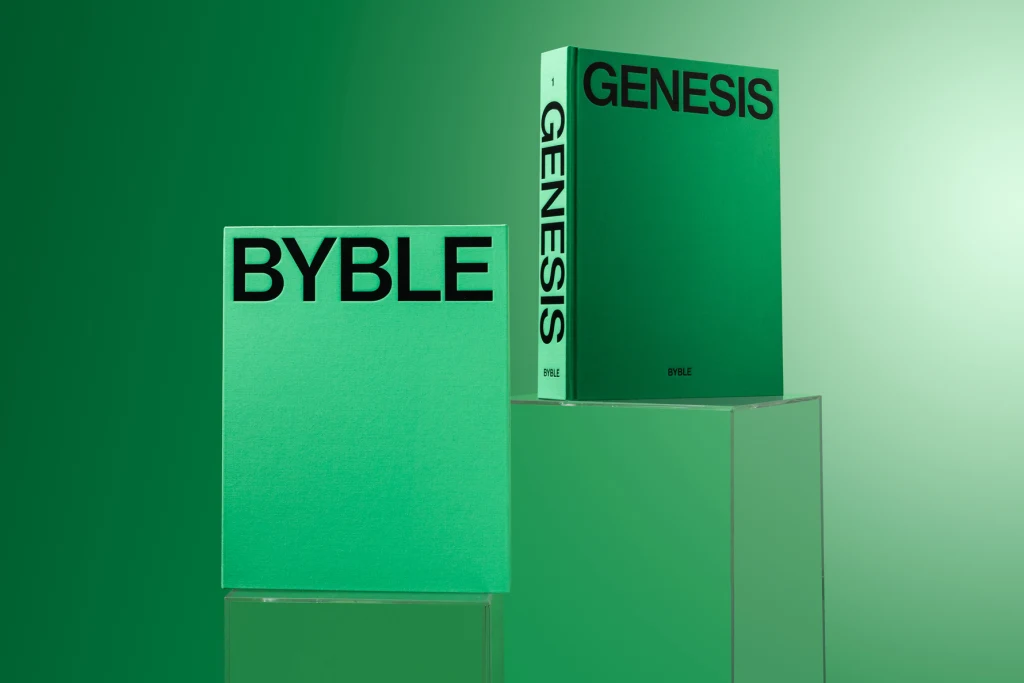
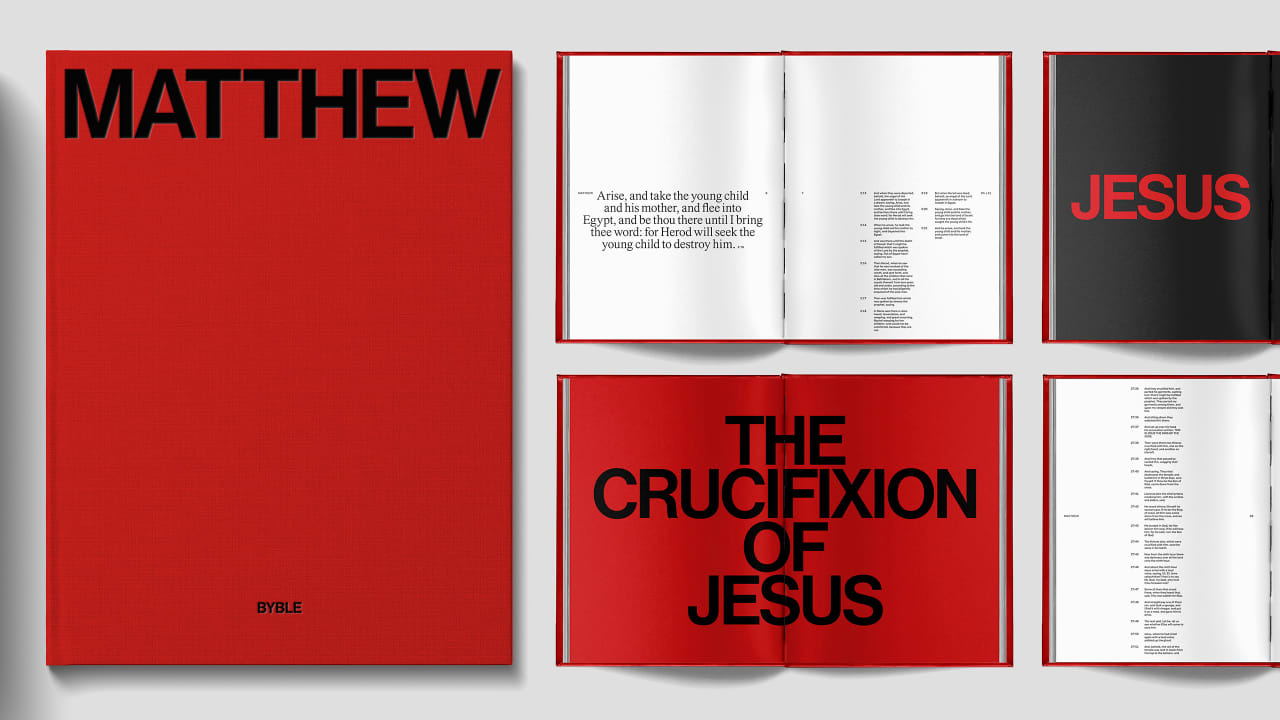
The Bible is a book utterly ripe for a redesign. So Dylan Da Silva did just that with his Byble project, which released a bespoke hypermodern 11.5-pound edition of Genesis (the first book of the Hebrew Bible and the Christian Old Testament) last fall, and this week is launching its next volume, Matthew (the first book of the Christian New Testament).
“Our mission, I guess, is simple—craftsmanship beyond words,” Da Silva says. “Crafting products so beautiful, they elevate the experience of reading the most powerful book ever written.”
The Genesis
Da Silva is not a designer, nor does he work in publishing. Rather, he comes from a property development background. Around 2022, the Sydney-based Da Silva was pondering how he could build a business around something of great meaning to him. He realized that while many people own a Bible, they generally don’t display it. And given that we live in a consumer society driven by aesthetics, he saw an opportunity to craft something new in that blank space.
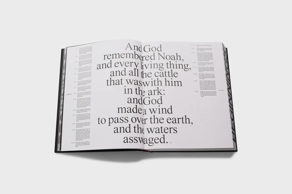
While he lacks visual design creds, he has experience with architectural design, and the Bible is very much a structural design challenge owing to its system of numbered verses and chapters. Da Silva wanted to keep the focus exclusively on the text (here, the King James Version—“the word is beautiful enough as it is”), so he decided not to feature any illustration or photography, and instead offer a solution that was purely typographic, which he developed with a partner in Greece over the course of two years.
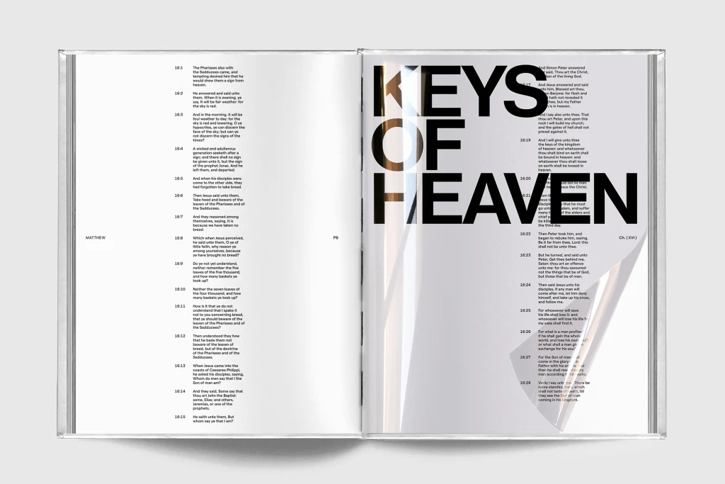
Another key goal was to design a system that would allow for a deeper reading of the Bible. To that end, he is breaking the Bible’s many books out of the larger whole and into single volumes, starting, naturally, with Genesis, which dominates the spine and cover of the first release in a debossed Grotesk. Da Silva drew inspiration from the Gutenberg Bible, with its distinct columns and margins and occasional typographic flair, and also sought to home in on particular moments for readers in pull quotes, translucent overlays, and bold all-caps spreads (the brand dubs these “yield” moments, thus the “Y” in “Byble”). It has the effect of slowing the books down and allowing text to breathe in an otherwise daunting 783,000-word experience.
“We obsess over every detail, every page, every layout,” he says. “Ultimately, we are accessible to the reader.”
OPENING A DOOR
In addition to the new text presentation, Da Silva went wild on the production specs for the 13×10-inch volumes. Rather than fragile gossamer pages, he brought in a hefty 220 gsm stock. Hardcovers with silkscreened fabric. Typographic edge painting. Each book is available in two colorways—in the case of Genesis, black or green, the latter being a tip of the hat to the Garden of Eden. And for Matthew, white and red, the latter signifying the blood of Christ.
All this production value comes at a cost: Currently the Byble costs $149, which has rankled some commenters on social media.
“Our cost to produce is quite expensive,” Da Silva says. “The margin is not massive; it’s a standard margin for a business. … I think we’re reasonably priced. I knew there was always going to be a pushback.”
Following Matthew, Da Silva is focusing on eight of the other most popular books of the Bible—Psalms, Proverbs, Exodus, Romans, Mark, Paul, John and Revelation. He wants to have five or six out by the end of the year, and then keep launching more from there, with special editions mixed in.
His target audience? The devout, of course, but also design lovers and those who the Byble aesthetic could resonate with in new ways.
“The goal for us is really reaching that younger generation who might be curious to learn more, who might think that the Bible is boring, or religion is boring,” Da Silva says. “We’re trying to open up a door for them.”