


Android’s youthful new design language just dropped
Google just announced a bold new look for Android, for real this time. After a false start last week when someone accidentally published a blog post too early (oh, Google!), the company is formally announcing the design language known as Material Three Expressive. It takes the colorful, customizable Material You introduced with Android 12 in […]


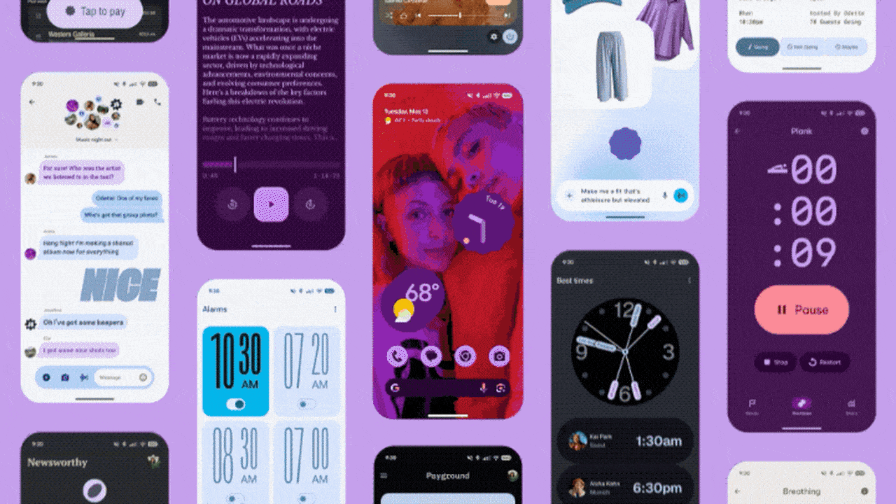
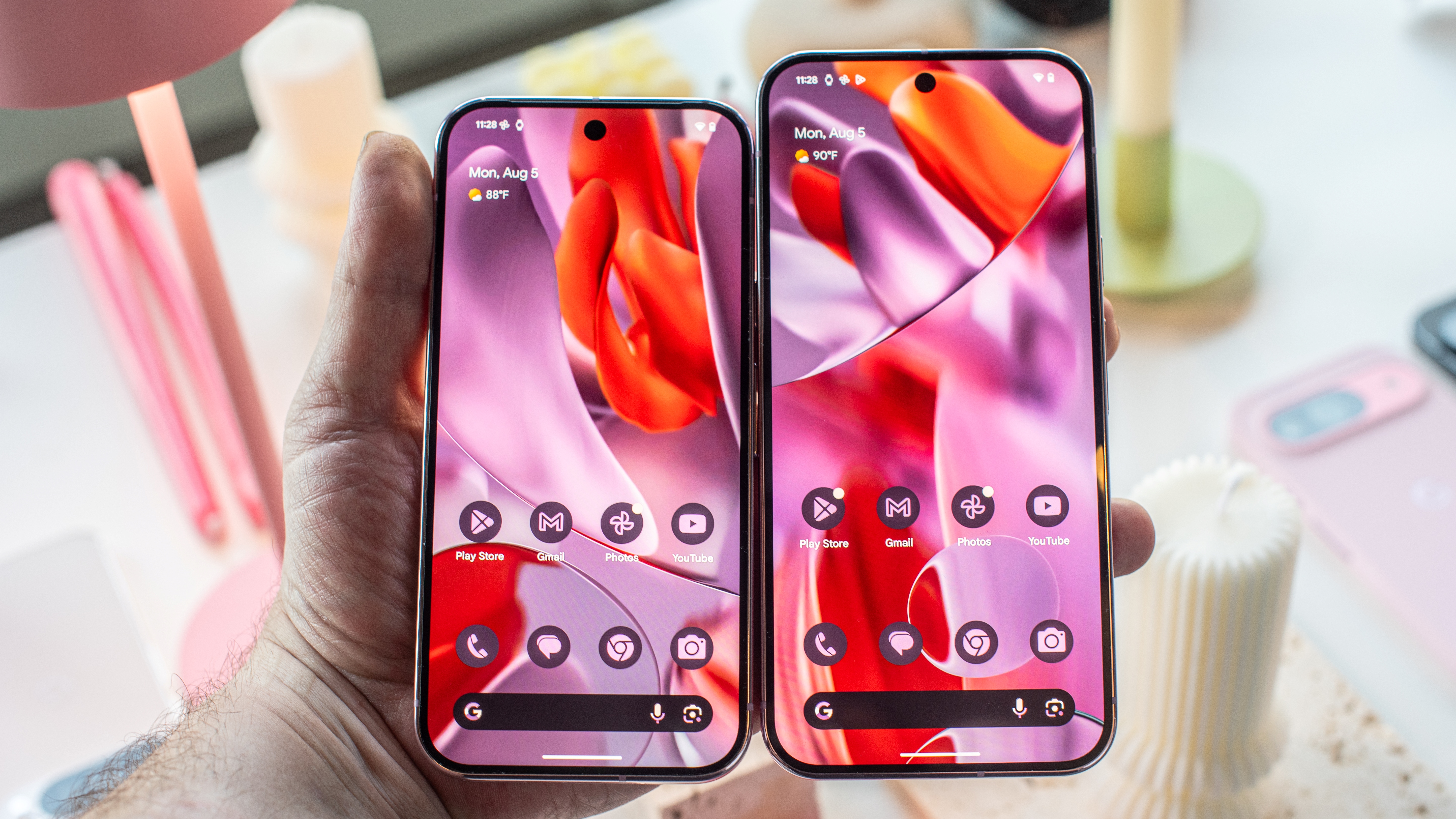
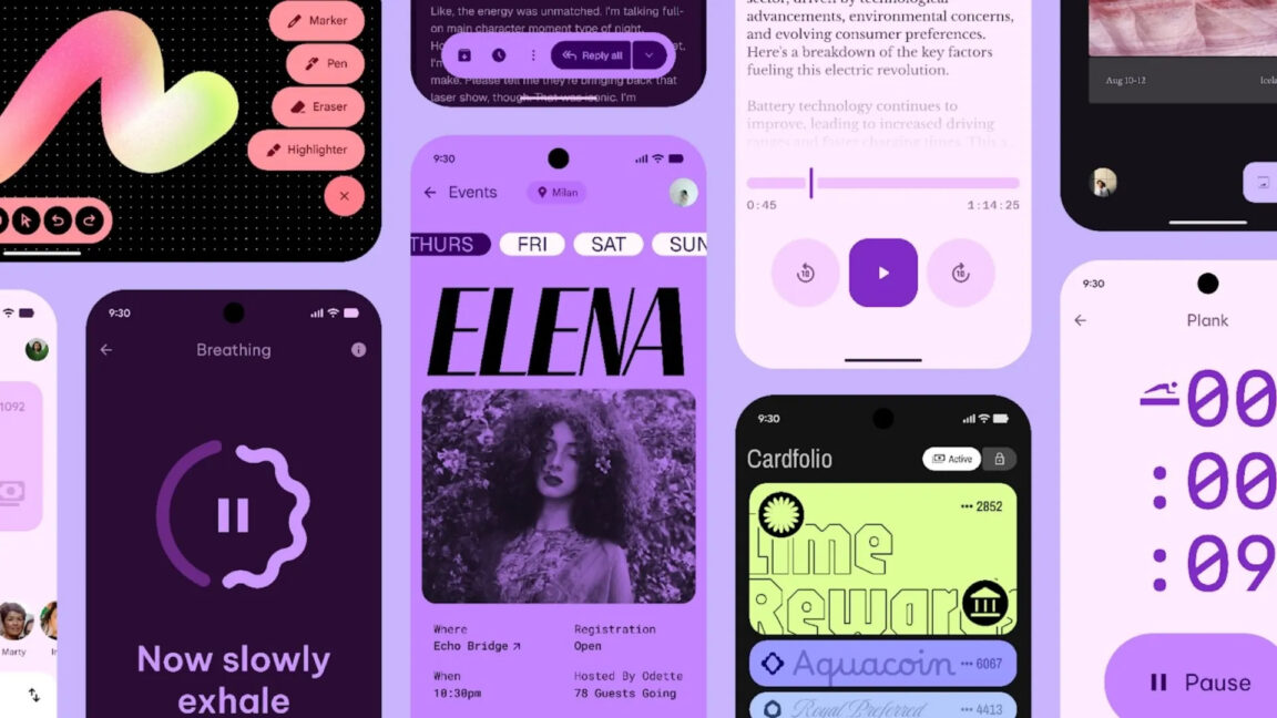
Google just announced a bold new look for Android, for real this time. After a false start last week when someone accidentally published a blog post too early (oh, Google!), the company is formally announcing the design language known as Material Three Expressive. It takes the colorful, customizable Material You introduced with Android 12 in an even more youthful direction, full of springy animations, bold fonts, and vibrant color absolutely everywhere. It’ll be available in an update to the Android 16 beta later this month.
Support for the Live Updates feature that Google introduced in an earlier Android 16 beta is nestled among the new design flourishes. It’s Android’s take on Apple’s Live Activities, showing time-sensitive updates in a persistent notification bar. Unlike Apple, Android limits its use to food delivery, navigation, and rideshare apps.


Today’s announcement gives us a good look at how those notifications will appear on the lockscreen, always on display, in a status bar at the top of the screen, and on the notification shade. It looks pretty handy. Quick settings will get an update too, allowing users to resize and rearrange tiles in another echo of iOS.
But the splashy new design language is the update’s centerpiece. App designers have new icon shapes, type styles, and color palettes at their disposal. Animations are designed to feel more “springy,” with haptics to underline your actions when you swipe a notification out of existence.

Google’s blog post and documentation for developers insist that this isn’t just a fresh coat of paint; the new design elements help guide users’ attention better. The bright purples and pinks featured throughout the company’s concept images certainly do the trick, and help boost the new design’s appeal with a younger demographic.
Teenagers are particularly fond of their iPhones, especially in the US, and Google seems hopeful that a fresh design will attract a younger user base. In its previously leaked, now-public blog post, Google says that up to 87 percent of 18–24-year-olds prefer expressive design like the one the company is debuting today. And while it’s definitely eye-catching, I have a feeling it’ll take a little more than this to turn the teens onto Android.


