


![31 Top Social Media Platforms in 2025 [+ Marketing Tips]](https://static.semrush.com/blog/uploads/media/0b/40/0b40fe7015c46ea017490203e239364a/most-popular-social-media-platforms.svg)


![[Webinar] AI Is Already Inside Your SaaS Stack — Learn How to Prevent the Next Silent Breach](https://blogger.googleusercontent.com/img/b/R29vZ2xl/AVvXsEiOWn65wd33dg2uO99NrtKbpYLfcepwOLidQDMls0HXKlA91k6HURluRA4WXgJRAZldEe1VReMQZyyYt1PgnoAn5JPpILsWlXIzmrBSs_TBoyPwO7hZrWouBg2-O3mdeoeSGY-l9_bsZB7vbpKjTSvG93zNytjxgTaMPqo9iq9Z5pGa05CJOs9uXpwHFT4/s1600/ai-cyber.jpg?#)


Coca-Cola’s clever new ad uses its logo in a refreshingly old-school way
A new ad from the Coca-Cola Co. opens with a shot of a typewriter clacking out Stephen King’s The Shining. The viewer follows a passage being written in an old-timey typeface until there’s a reference to a bottle of Coke. Suddenly, the type appears as the cola company’s script logo. The ad is part of a new campaign called “Classic” running in Spain and the U.K., in which Coca-Cola highlights instances when its brand name appears in literature by rendering them in the books’ original first-edition typefaces. The passages are printed in black, and references to either “Coke” or “Coca-Cola” in passages from King’s The Shining, J. G. Ballard’s Extreme Metaphors, and V. S. Naipaul’s A House for Mr. Biswas are rendered in logo format. Coke’s red logo pops against the white paper amid the black retro type. [Photo: Courtesy of VML] The approach emphasizes Coke’s legacy and plays on nostalgia in an analog medium and in an analog way. While so much of soda marketing is contemporary and youth-oriented, Coke is doing the opposite. It found a clever way to remind viewers that it’s been part of culture long before e-readers and cellphones by going back to print. It’s anti-trend and purposefully old-school, using the brand’s history and resonance in culture as social proof of its legacy. The campaign will appear on outdoor billboards and signage, streaming radio, online video, print, and cinema. Out-of-home posters show passages printed on paper, complete with page numbers and the books’ author and title. [Photo: Courtesy of VML] The challenge for the creatives behind “Classic” was how to reinforce “the timelessness and authenticity of Coca-Cola in a world where trends reign,” says VML, the marketing agency that worked with Coke’s agency, WPP Open X, to create the campaign. “Coca-Cola has always been more than a beverage—it’s a cultural icon that naturally finds its way into the stories we love,” Rafael Pitanguy, VML’s deputy global chief creative officer, said in a statement. “With ‘Classic,’ we’re honoring that legacy by bringing its literary presence to life in a way that feels both nostalgic and fresh.” Coca-Cola has played with its vintage-style script logo in new and surprising ways recently, like in a 2024 campaign from VML and WPP Open X that used authentic but unauthorized hand-drawn examples of the logo. And to promote recycling last year, Coca-Cola’s campaign with Ogilvy New York used smashed versions of the logo as they appear on crushed cans. With “Classic,” Coca-Cola isn’t so much finding experimental or clever ways to break from its brand guide like in some of last year’s creative. Instead, it’s finding a novel way to impose its brand guide onto culture, showing how Coke is embedded into literary history itself.
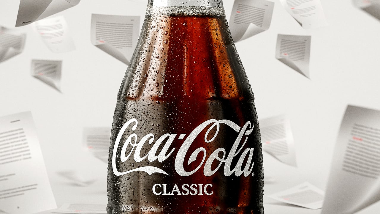
A new ad from the Coca-Cola Co. opens with a shot of a typewriter clacking out Stephen King’s The Shining. The viewer follows a passage being written in an old-timey typeface until there’s a reference to a bottle of Coke. Suddenly, the type appears as the cola company’s script logo.
The ad is part of a new campaign called “Classic” running in Spain and the U.K., in which Coca-Cola highlights instances when its brand name appears in literature by rendering them in the books’ original first-edition typefaces. The passages are printed in black, and references to either “Coke” or “Coca-Cola” in passages from King’s The Shining, J. G. Ballard’s Extreme Metaphors, and V. S. Naipaul’s A House for Mr. Biswas are rendered in logo format. Coke’s red logo pops against the white paper amid the black retro type.

The approach emphasizes Coke’s legacy and plays on nostalgia in an analog medium and in an analog way. While so much of soda marketing is contemporary and youth-oriented, Coke is doing the opposite. It found a clever way to remind viewers that it’s been part of culture long before e-readers and cellphones by going back to print. It’s anti-trend and purposefully old-school, using the brand’s history and resonance in culture as social proof of its legacy.
The campaign will appear on outdoor billboards and signage, streaming radio, online video, print, and cinema. Out-of-home posters show passages printed on paper, complete with page numbers and the books’ author and title.

The challenge for the creatives behind “Classic” was how to reinforce “the timelessness and authenticity of Coca-Cola in a world where trends reign,” says VML, the marketing agency that worked with Coke’s agency, WPP Open X, to create the campaign.
“Coca-Cola has always been more than a beverage—it’s a cultural icon that naturally finds its way into the stories we love,” Rafael Pitanguy, VML’s deputy global chief creative officer, said in a statement. “With ‘Classic,’ we’re honoring that legacy by bringing its literary presence to life in a way that feels both nostalgic and fresh.”
Coca-Cola has played with its vintage-style script logo in new and surprising ways recently, like in a 2024 campaign from VML and WPP Open X that used authentic but unauthorized hand-drawn examples of the logo. And to promote recycling last year, Coca-Cola’s campaign with Ogilvy New York used smashed versions of the logo as they appear on crushed cans.
With “Classic,” Coca-Cola isn’t so much finding experimental or clever ways to break from its brand guide like in some of last year’s creative. Instead, it’s finding a novel way to impose its brand guide onto culture, showing how Coke is embedded into literary history itself.


![How to Find Low-Competition Keywords with Semrush [Super Easy]](https://static.semrush.com/blog/uploads/media/73/62/7362f16fb9e460b6d58ccc09b4a048b6/how-to-find-low-competition-keywords-sm.png)